The analytics are mind boggling. But the story isn’t analytics. The designs will wow you. But the story isn’t design.
The story, as it has been in each of the past 10 years, is that these amazing analytical designs sprang from the minds of students – North Carolina State University College of Design students – taking part in the latest SAS Design/NCSU College of Design collaboration.
SAS, NCSU design partnership celebrates 10 years
This year’s design project marks the 10th anniversary of the SAS-NCSU collaborative partnership. This year is also the 75th anniversary of the NCSU College of Design, and it is NCSU Department Head of Graphic Design + Industrial Design Tsailu Liu’s, last year at NC State.
Following opening comments by SAS Head of Product Design Rajiv Ramarajan, Professor Liu took the stage and introduced a celebratory video in which SAS Head of Product Experience Christine Browning, NCSU Professor of Graphic & Experience Design Helen Armstrong, and Product Design Manager & NCSU Graphic Design alumnus Macklin Frazier comment on the partnership.
After the video, Liu reflected on the history and success of the partnership and the value of good design to businesses. He presented Browning (on behalf of SAS) a commemorative trophy (designed by Liu) featuring the number 10, stylized such that the one and zero not only represent the partnership’s 10th anniversary but also allude to the collaborative nature of the partnership and to the binary digits that form the basis of all computer systems.
For the 10th consecutive year, SAS sponsored an analytics-based design project with the NC State College of Design. Throughout the project, SAS Design staff provided mentoring and guidance, but, make no mistake, the resulting designs are the students’ creations. And, wow, are they impressive. Impressive, too, are the presentations and demos of their designs that the students recently delivered at SAS world headquarters, which you can, and should watch in the video above – you know what they say about the relative value of pictures and words.
And speaking of the relative value of pictures and words, this year’s design topic was System Visualization.
“Modern systems are getting more complex – we try to make sense of these systems; get the most out of them,” said SAS Head of Product Design Rajiv Ramarajan in his introduction to the presentations. “However, visualizing and interacting with these systems is becoming more and more challenging.”
Assistant Professor Jarrett Fuller from the College of Design, the students’ professor for this project, explained further.
“Our lives are increasingly governed by complex, dynamic, networked systems of hardware and software and sensors and data and artificial intelligence – we call this, sort of broadly, internet of things,” Fuller said. “The problems here are not necessarily problems of technology, a lot of this technology already exists … [it]isn’t even a question of data necessarily … the problem is that it’s hard to make these systems visible; it’s hard to make them legible to a variety of users or stakeholders or consumers. So, the problem here is one of user experience, one of interaction – one of design.”
Reducing food waste
To kick off the project, the SAS team gave the students a design prompt in which Deca Foods, a fictional, multinational food distribution company (the name is a nod to the 10th anniversary of the partnership), is seeing an increase in food waste in the supply chain, whether it be perishables perishing due to delays or weather events, equipment failures preventing on-time delivery or other situations that could be mitigated through both proactive and reactive analysis and actions. Hence, the students were tasked with creating an interface that would visualize the supply system, simulate and enact changes and generate reports.
Where to begin
Clearly, reducing food waste for a fictional company is a fairly broad set of marching orders, so the class broke up into five teams: two focused on visualization, two on simulating and enacting, and one on reporting. From there they would further refine their respective missions and develop detailed scenarios and narratives. They also explored three personas – representing their systems’ potential user types — given to them by the SAS Design team: Luigi, a logistics manager; Delores, a data scientist; and Edna, a corporate executive.
After weeks of investigation, competitive analysis, feature set exploration, wire-framing and discussions with the SAS team, the students produced the high-fidelity working prototypes that they present in the video above.
The following paragraphs provide brief, high-level summaries of their designs, but, unless you just really prefer text to video, do yourself a favor: stop reading and go watch the video to fully appreciate what these remarkable future design leaders produced, as the following descriptions can’t possibly do the presentations justice – pictures vs. words, remember?
Visualization – Teams Liatris and Hive
The teams behind the two visualization systems, Liatris and Hive, both developed logistical transport scenarios: one that would require a proactive solution to a foreseeable potential problem, the other would require implementing an on-the-fly reaction to an urgent unexpected problem.
Liatris: Soumya Batra, Lilly Gonzalez, Grace Herring, Andy Li and Madeline Rabe

Team Liatris’ scenario involved Deca receiving orders for its kombucha products that would require the company to ship them further and to a warmer region than ever before – in this case, from North Carolina to Orlando, Florida. Liatris predicts the potential problem and alerts Luigi, the logistics manager, to a possible spoilage risk in the truck carrying those orders, posed by the extended time the product will have to spend on the truck, as well as the higher temperatures on the truck’s route.
Liatris not only recognizes and alerts Luigi to the risk but prompts him with suggested solutions and, through predictive data visualizations, the likely outcomes from implementing those solutions. Once Luigi accepts a solution, he can track the status of that truck and its contents – and all other trucks in the fleet – through Liatris, which is constantly receiving data from onboard IoT sensors. Once the order is delivered, Liatris prompts Luigi to send a report of the delivery to the appropriate executives.
Key features of Liatris include:
- A pinnable tracking dock where the user can monitor critical tracking points by dragging them into the dock.
- Adaptive visualizations, powered by predictive analytics, that help the user understand the risks associated with actions.
- Smart alerts based on confidence levels to indicate priority.
Hive: Anabel Russo, Alexis Boone, Morgan Peele and Quynh Vo
In the Liatris demo, the system identified a risk and helped Deca avoid it proactively. In Team Hive’s scenario, Deca’s logistics manager, Luigi, must react to an unforeseeable equipment breakdown and implement a solution before the transported product – in this case, avocados traveling from Mexico to the Southeastern United States – can spoil.
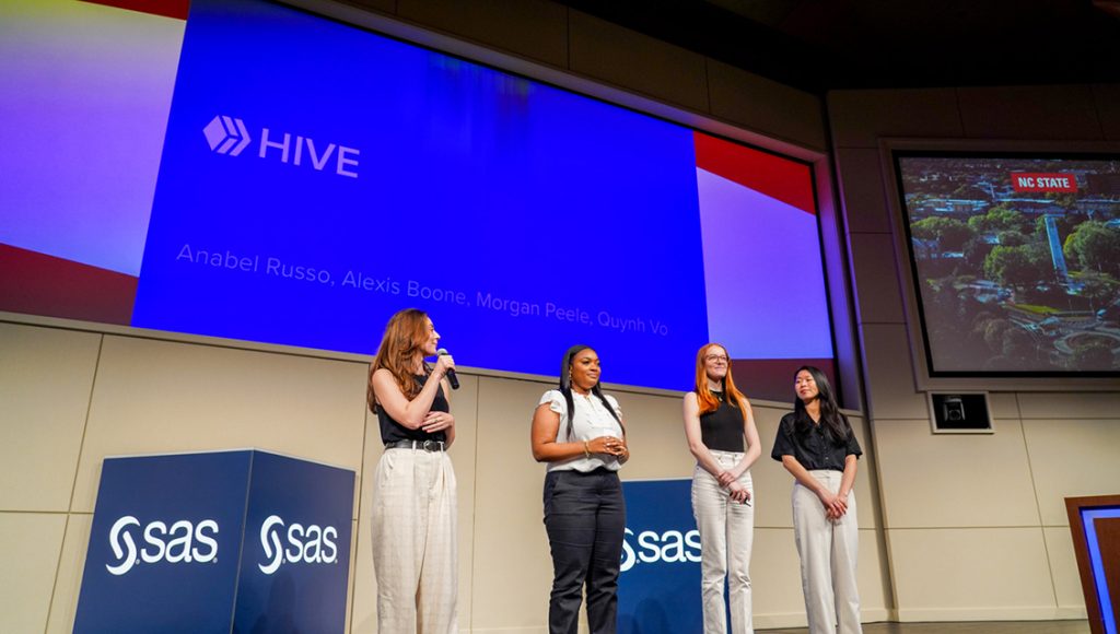
The Hive dashboard defaults to an interactive map showing all the Deca warehouse locations along with an expandable/collapsible stats sidebar and truck-status bottom bar. Luigi can filter the map and status bars by a variety of criteria and drill down for more details. While working in the dashboard, Hive alerts Luigi that a truck in Atlanta has malfunctioned. He clicks on the alert to display more information as well as a suggestion: Transfer the cargo to a nearby active truck that has available cargo space.
Hive’s AI considers all the trucks in the area and recommends three possibilities in the sidebar. Expanding the sidebar provides detailed data on the recommended trucks (as well as the ability to view others in the area) so that Luigi can select what he feels is the best option and effect the transfer. Avocados saved.
Key features of Hive include:
- A customizable dashboard that adapts based on the user’s preferences through a filtering system and intuitive scaling. Sidebar displays daily statistics and bottom bar displays active trucks; filtering system lets you home in on a specific area, warehouse, customer, etc.
- An intelligent alert system with AI integrated solutions to quickly address and solve issues. It allows the user to easily identify the best option and enact changes, and it provides the ability to store data and review history.
- Live tracking allows the user to view where a truck is on the map, sensor data, which orders are in the truck, delivery timeline and more.
Simulating and enacting – Teams Sunny Side and Orchid
The Sunny Side and Orchid teams both tackled scenarios involving the risk of serious, large-scale environmental events disrupting Deca’s ability to produce and move its products. In these scenarios, the designs must be able to run AI-powered simulations and enact changes to Deca’s supply chain system as needed.
Sunny Side: Megan Brown, Sena Celik, Parinita Das, Kate Warren and Jennifer Dowden
In the Sunny Side scenario, logistics manager Luigi is responsible for shipment and delivery of eggs to the Northern and Western US regions. When checking live logistics data on the Sunny Side dashboard, Luigi gets an alert indicating that rising temperatures are creating a risk of wildfires in Northern California.
To see how the potential wildfires could affect egg deliveries, Luigi pulls up a shipment tracking digital twin that Data Scientist Delores has created in Sunny Side. From inside the digital twin, Luigi can select from among several recommended models – in this case he chooses “wildfire conditions” (suggested by Sunny Side based on the weather notification he received), which opens a new model of the live system, pre-populated with metrics based on the alert, and he schedules the simulation to run after hours.
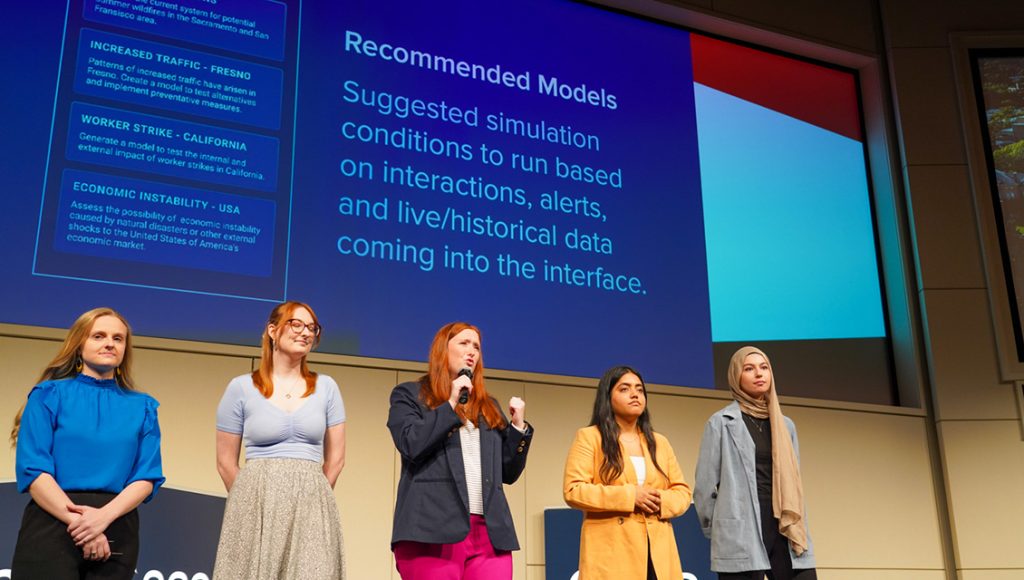
The next day, while checking the dashboard, Luigi is notified that the simulation is complete. He clicks on the notice to open the simulation summary, which indicates how the logistical system would have performed given the simulated conditions. In this case, the simulation rates the system as being not effective, predicting excessive food waste as well as other inefficiencies.
Seeing that the current system is likely inadequate to handle the potential extreme conditions, Luigi uses Sunny Side to duplicate and optimize the model, then runs a simulation on the new model. Once the optimized simulation is complete, Sunny Side notifies Luigi, who then views the results, which are more favorable – less food waste, higher efficiency – than those from the last simulation. Luigi, pleased with the results, selects recommended actions and pushes them to the live system.
Key features of Sunny Side include:
- Recommended models that suggest simulation conditions to run based on interactions, alerts, and live/historical data coming into the interface.
- Model views – Dual views show hierarchical relationships of the simulations to the live system, including a list view and a branch view; the latter also shows simulations applied to the live system.
- Automated actions – Based on prior human actions, the interface automatically simulates and enacts small-scale changes.
Orchid: Tucker Baumgartner, Sally Bui, Vaishnavi Parni and Peyton Tucker
Team Orchid has Deca’s trusty logistics manager, Luigi, dealing with a tropical monsoon at the company’s Telangana rice farms in India that could disrupt not only the production infrastructure but also access to live data.
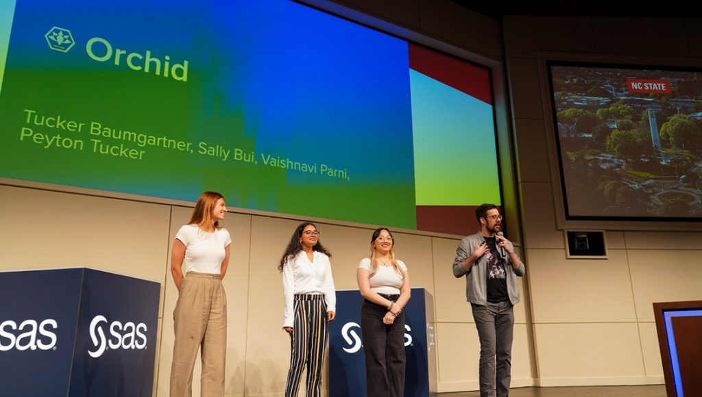
Prior to the storm, the multi-platform Orchid interface sends an alert to Luigi’s phone that the monsoon is likely to affect some of the rice farms, giving him time to push out advisories and choose from AI-suggested options to protect the crops from the storm. Two days later, the storm hits and when Luigi logs on to Orchid, he sees that he’s lost live data from some of the farms, triggering Orchid to switch into its “Twin Mode” modeling environment.
From here Luigi can go from a macro view to a micro view that shows the farms’ production and storage facilities as groups of hexagonal shapes, with affected ones rendered in red. Luigi clicks a dropdown associated with a particular hex to display relevant data associated with that facility as well as AI-recommended actions and insights into why the AI made those recommendations. Clicking a farms’ pull-down menu in the hex view displays an interactive rendering of the farm and related facilities.
From here, Luigi can look at a “route view,” which displays sensor data from the train carrying the product or click on one of the farm plots to show detailed data and the last live video footage of the farm. He can also see in these views the effect of any of his prior actions. A log shows every action taken, both by humans and by Orchid.
Once power is restored in India and live data is once again available, Orchid prompts Luigi to save his model or sync the live data to his model.
Key features of Orchid include:
- Hex shapes remove the visual noise from conventional maps, allowing the data to shine.
- Flexible, constantly learning multi-platform AI that provides transparent decision-making tools. Both mobile and desktop versions increase users’ reactive abilities.
- Hi-fidelity models make systems legible. They display weather, time, faults and more in an interactive and engaging visual representation.
Reporting – Team Report Farm
Report Farm: Carter Avayou, Jazz Moe, Noah Pataky, Keymoni Sakil-Slack and Shariesa Taylor
While the other teams were focused on visualizing, simulating and enacting changes to Deca’s systems, Team Report Farm’s mission was to create a dashboard through which users can check the status of various aspects of the system and build comprehensive, shared reports based on real-time data from IoT sensors throughout the system.
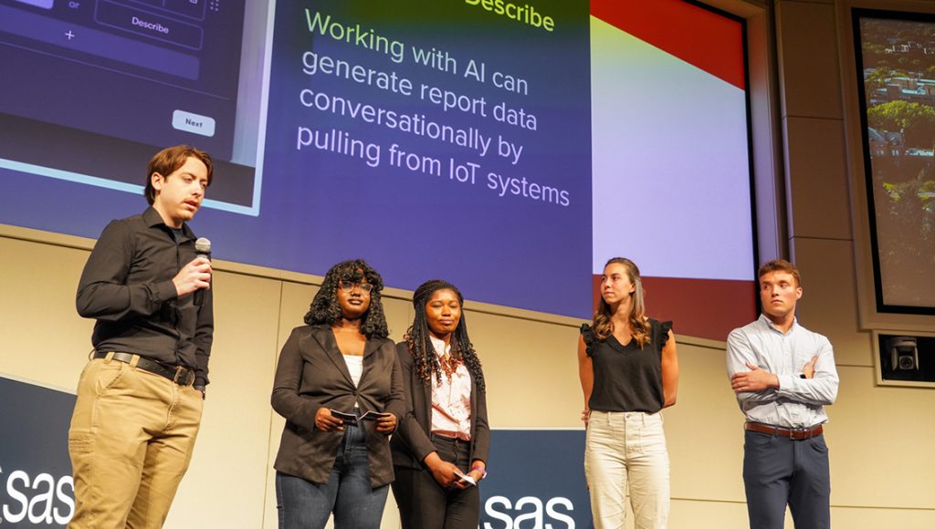
For their scenario, the team has focused on the Delores persona, a data analyst. Report Farm is constantly monitoring the system, so when Delores opens her dashboard, she sees that some locations are flagged as needing attention. Clicking on the Acro Farm location, she sees that Report Farm’s AI has generated a summary of the farm’s detected issues and that the farm is underperforming.
From the dashboard, Delores clicks the "create report" button, which provides her with a number of report types to choose from. In this case, she chooses to create a performance report, thereby opening the editing window.
To add components to the report, Delores has the option of using AI-recommended content, manually entering a prompt, or a combination of both. She can add additional modules and sections as necessary. Once she’s finished, Report Farm gives her an in-depth view of the report where she can edit existing components or add more. When she is finished, she can send the report through Report Farm to other interested parties, like executives or Logistics Manager Luigi.
Key features of Report Farm include:
- Smart templating provides pre-generated templates for commonly used reports that can be self-edited or edited by AI.
- Suggest and describe is used to generate report content conversationally, with AI pulling data from IoT sensors.
- Interactive reports allow users to easily edit components, varying from text to graphical display, as well as inviting others to collaborate and leave comments that can be resolved using AI.
Check out these scenes from the event; photos courtesy of NC State University:
-
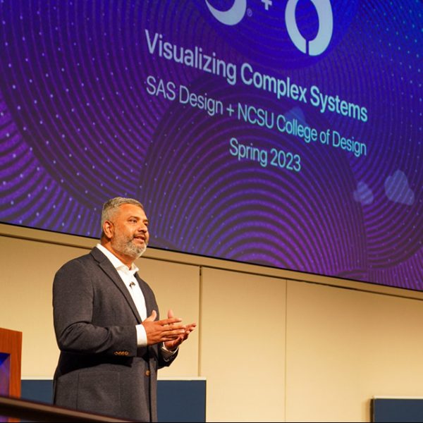
- Rajiv Ramarajan welcomes the audience and delivers opening remarks.
-

- Professor Liu reflects on the 10 years of the SAS and NCSU College of Design partnership.
-

- The live audience was impressed and enthralled — just as you will be when you watch the video.
-
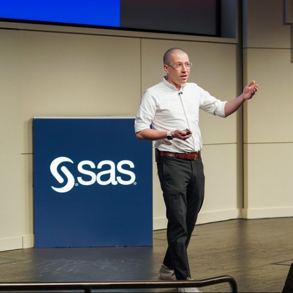
- Jarrett Fuller, the students’ professor details the various stages of the project.
-
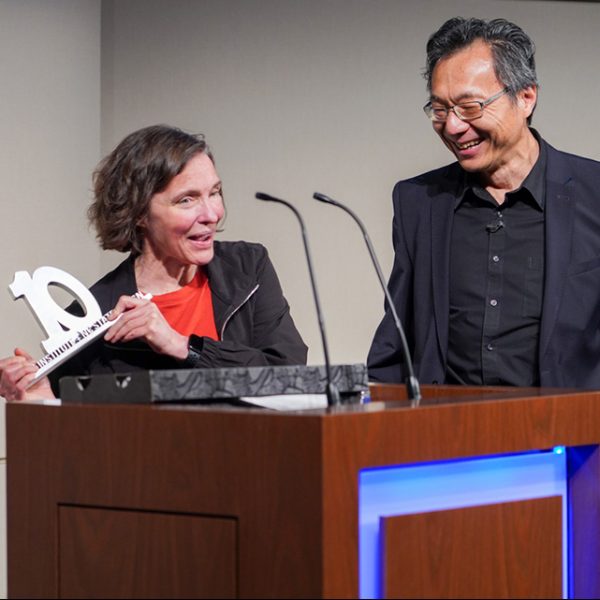
- Christine Browning accepts, on behalf of SAS, the 10-year commemorative trophy from Professor Liu, which he designed himself.
-

- The live audience was impressed and enthralled — just as you will be when you watch the video.
-

- After their on-stage presentations, the students discussed their projects with and took questions from attendees in the EBC demo hall.
-

- Chief Technology Officer Bryan Harris discusses the Orchid interface with its creators.
-

- After their on-stage presentations, the students discussed their projects with and took questions from attendees in the EBC demo hall.
-

- After their on-stage presentations, the students discussed their projects with and took questions from attendees in the EBC demo hall.
-

- SAS’ Brett Wujek discussed the projects with students and took questions from attendees in the EBC demo hall.
-
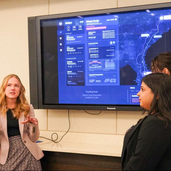
- After their on-stage presentations, the students discussed their projects with and took questions from attendees in the EBC demo hall.